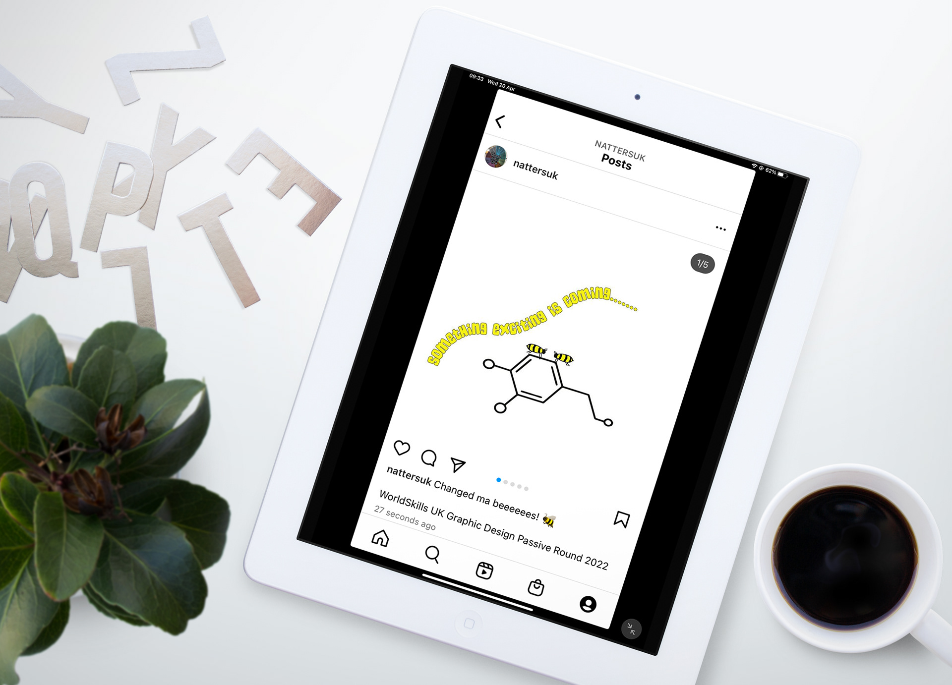
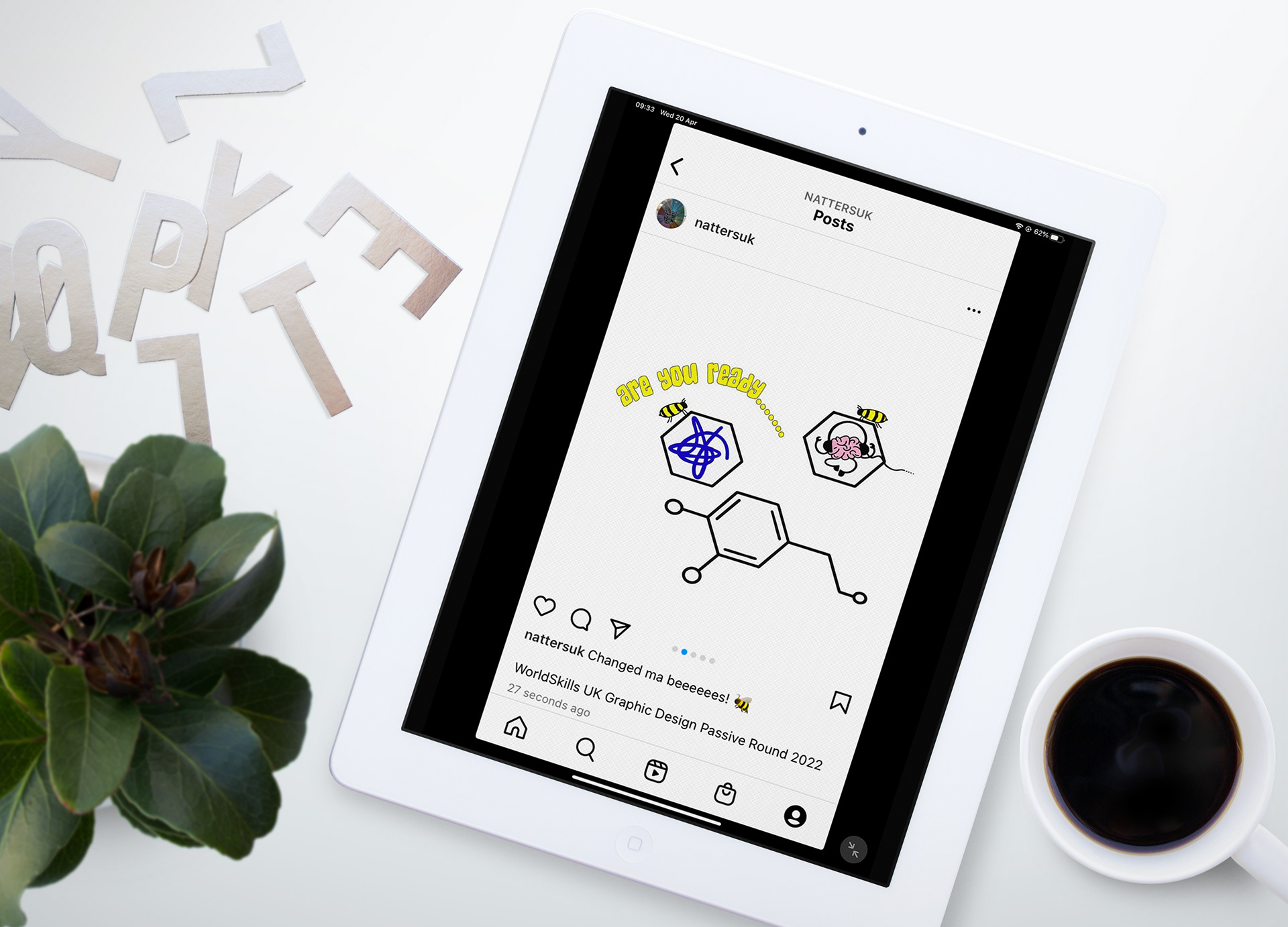
Instagram Posts - each post will have a roadie bee building up the logo
Instagram Post Mock Ups


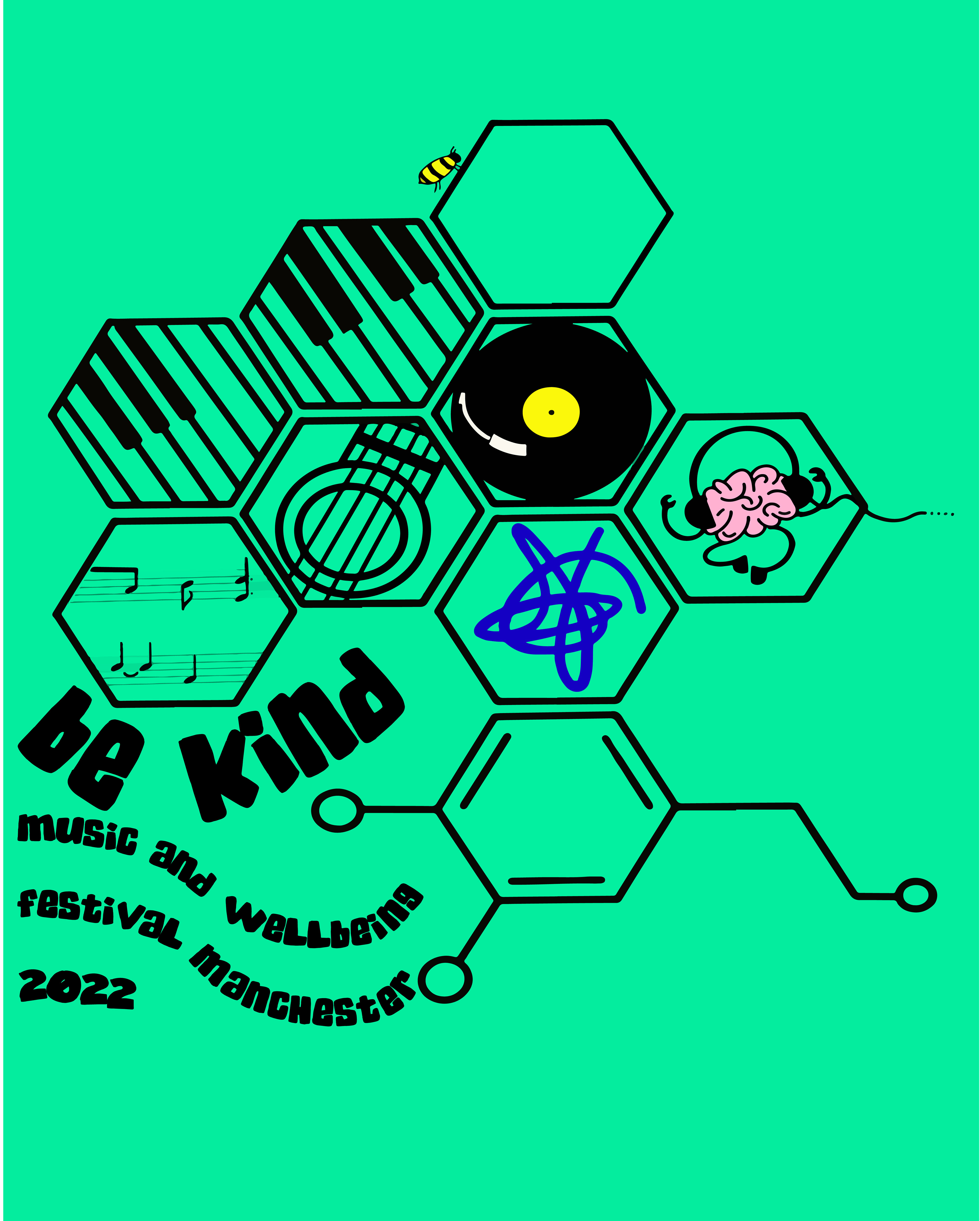
Short gif of the Be Kind Logo
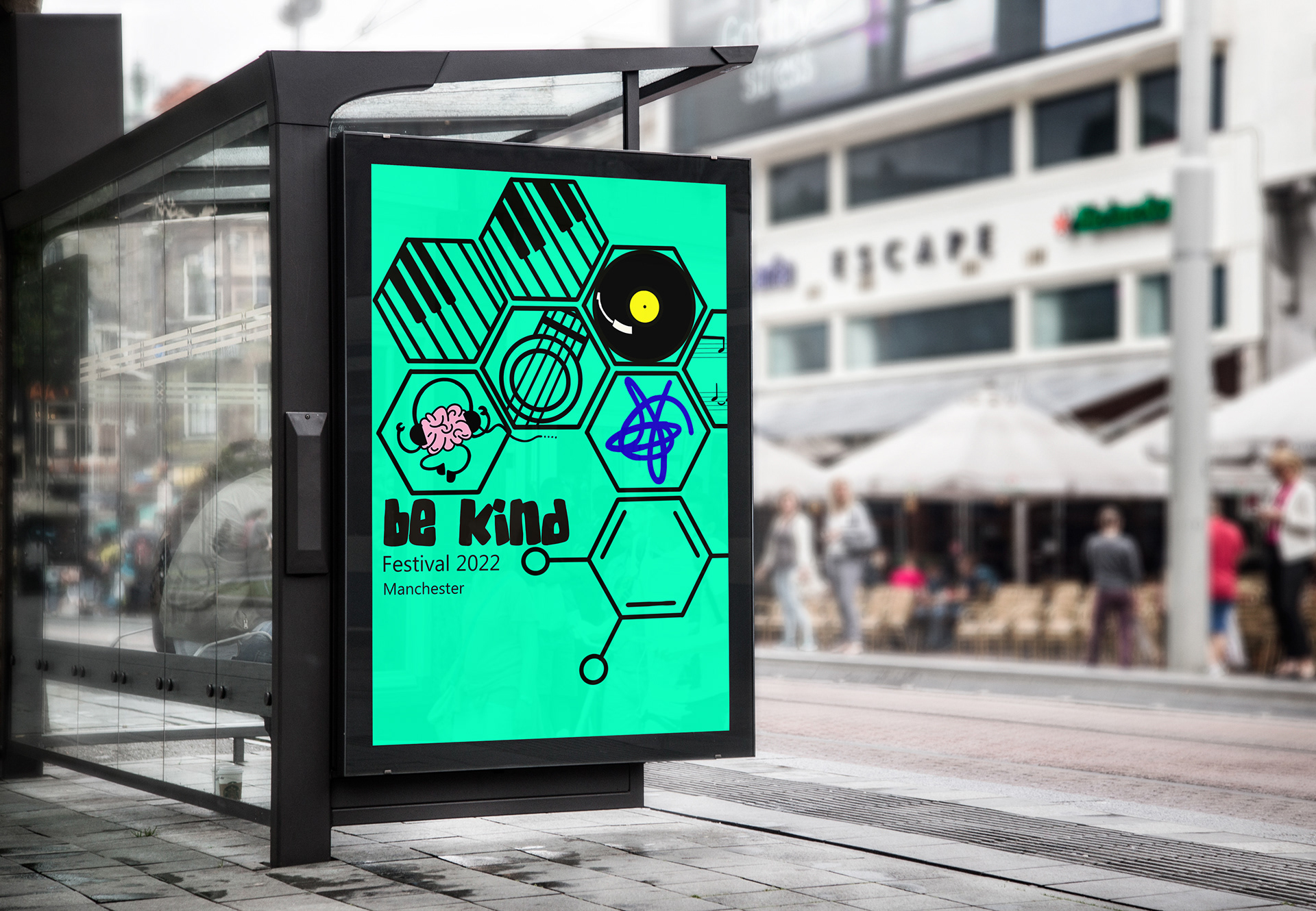
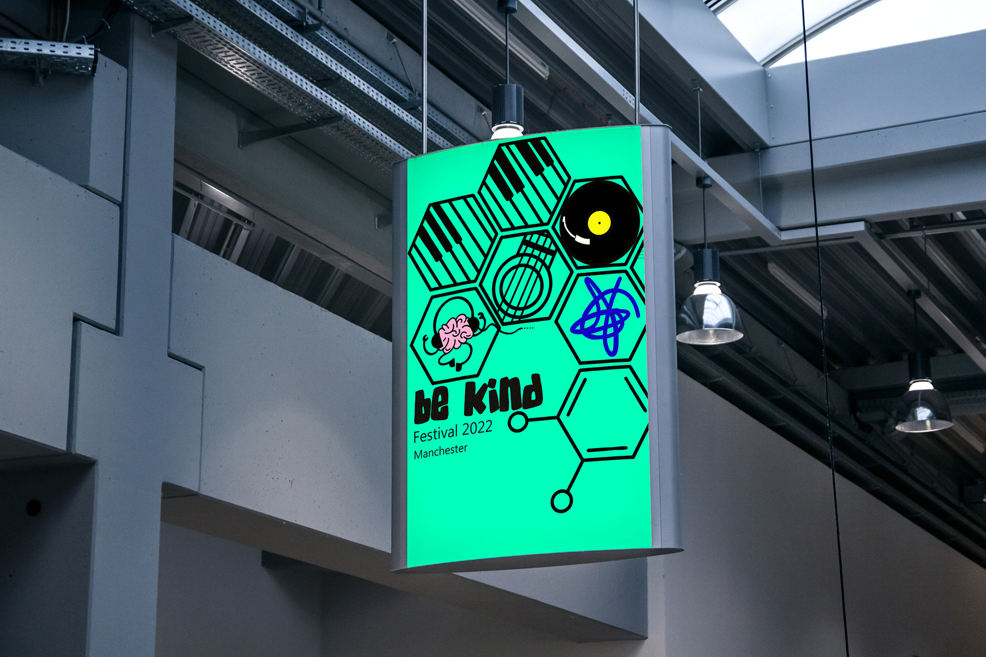
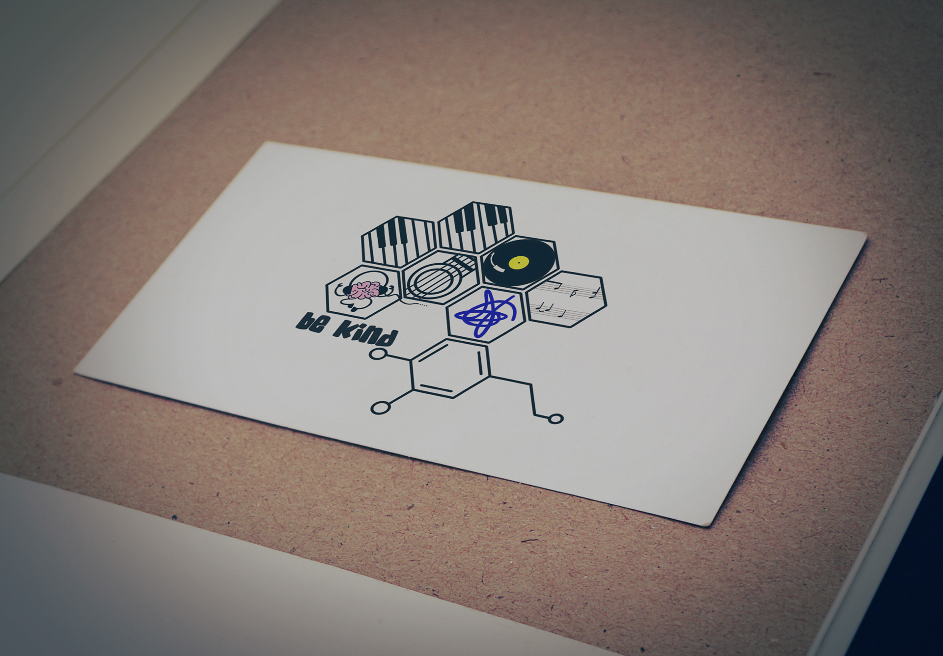
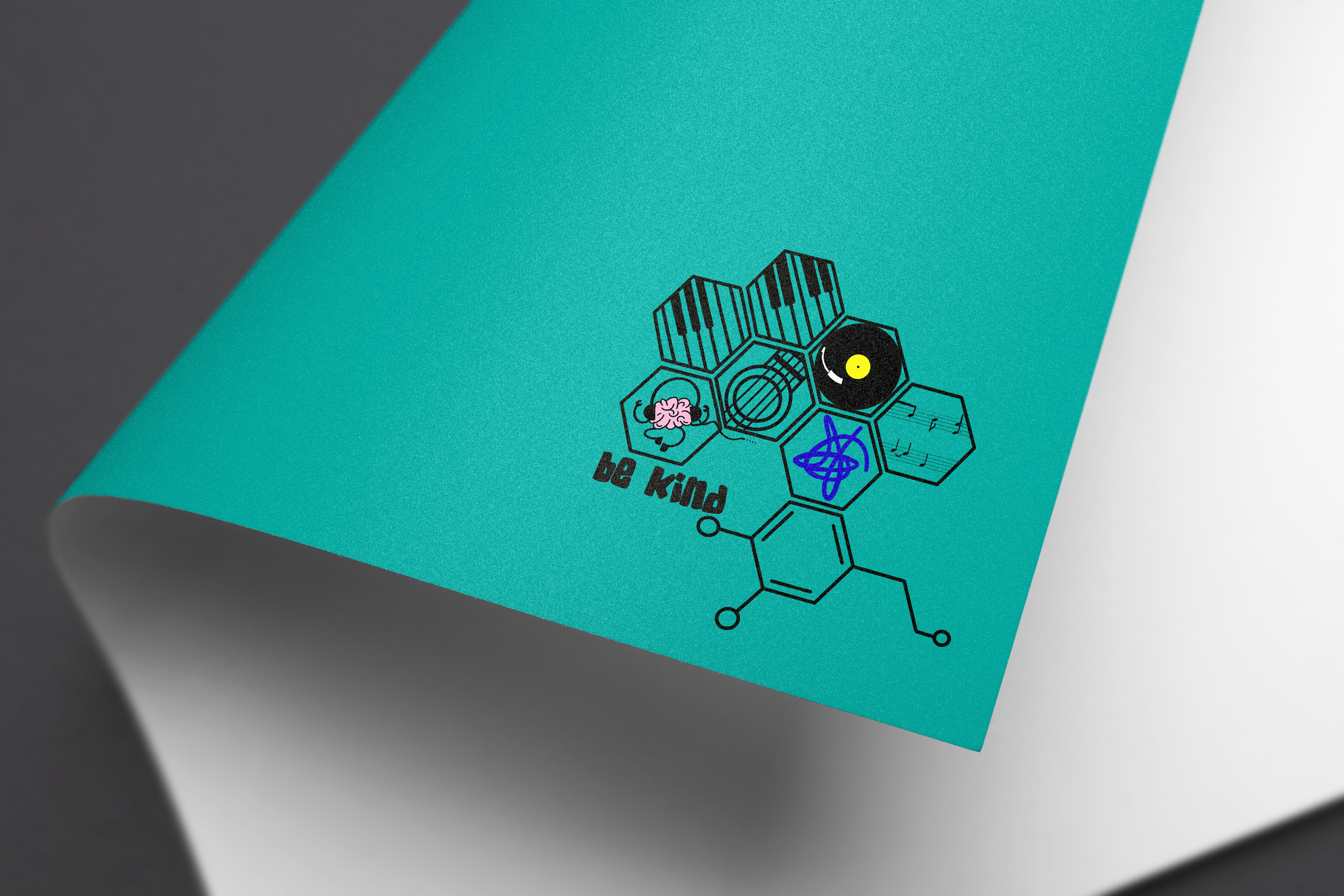
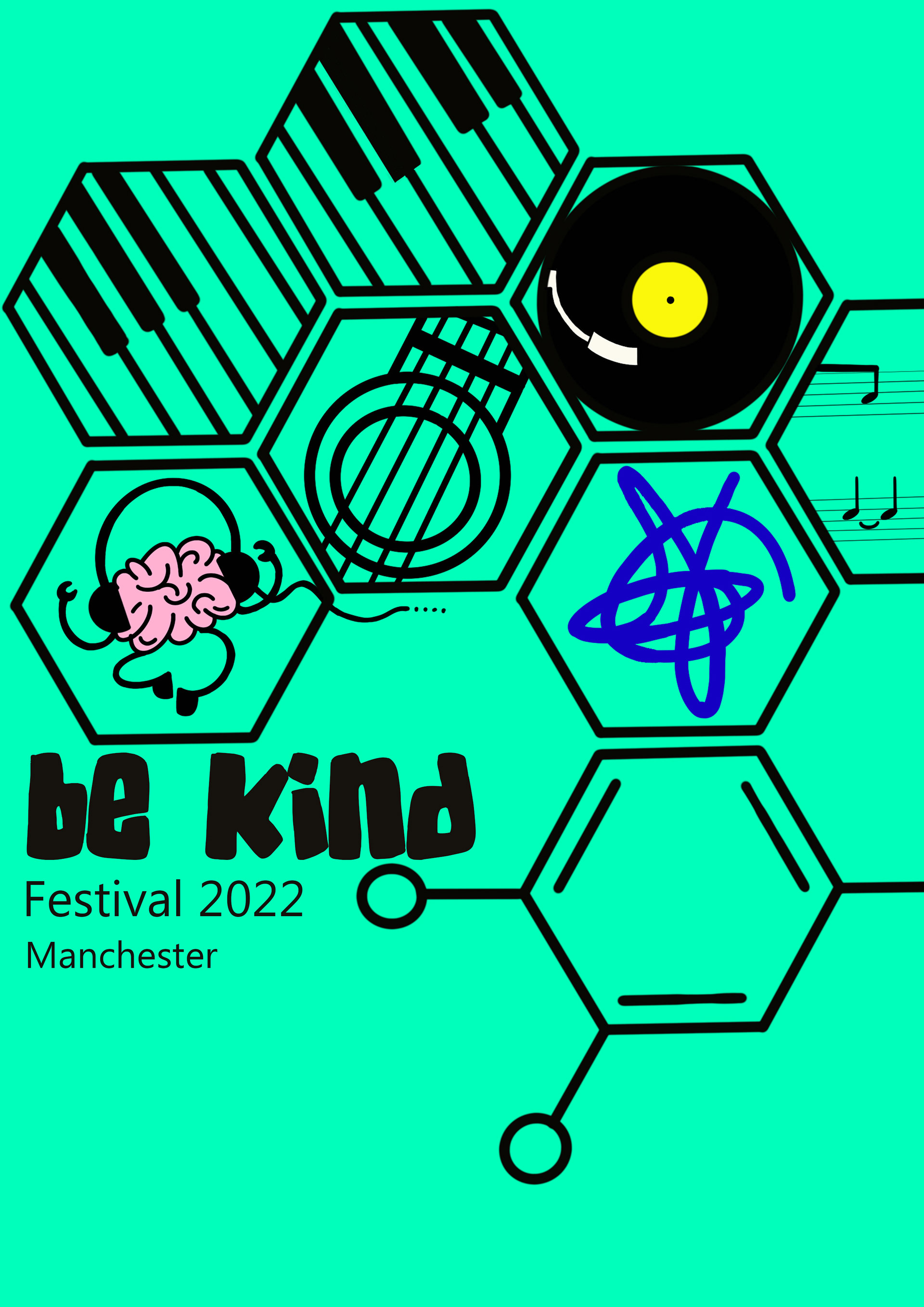
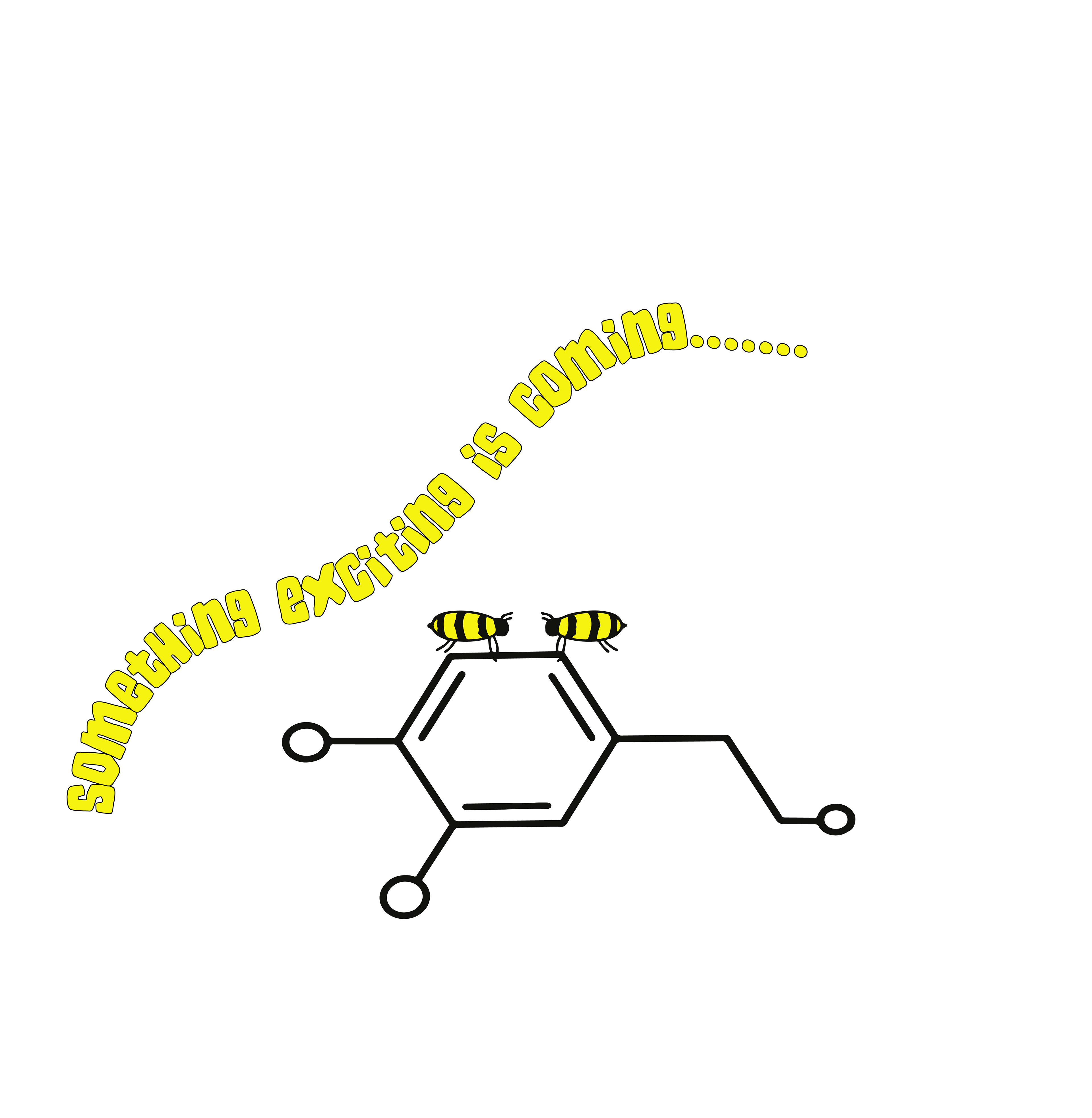
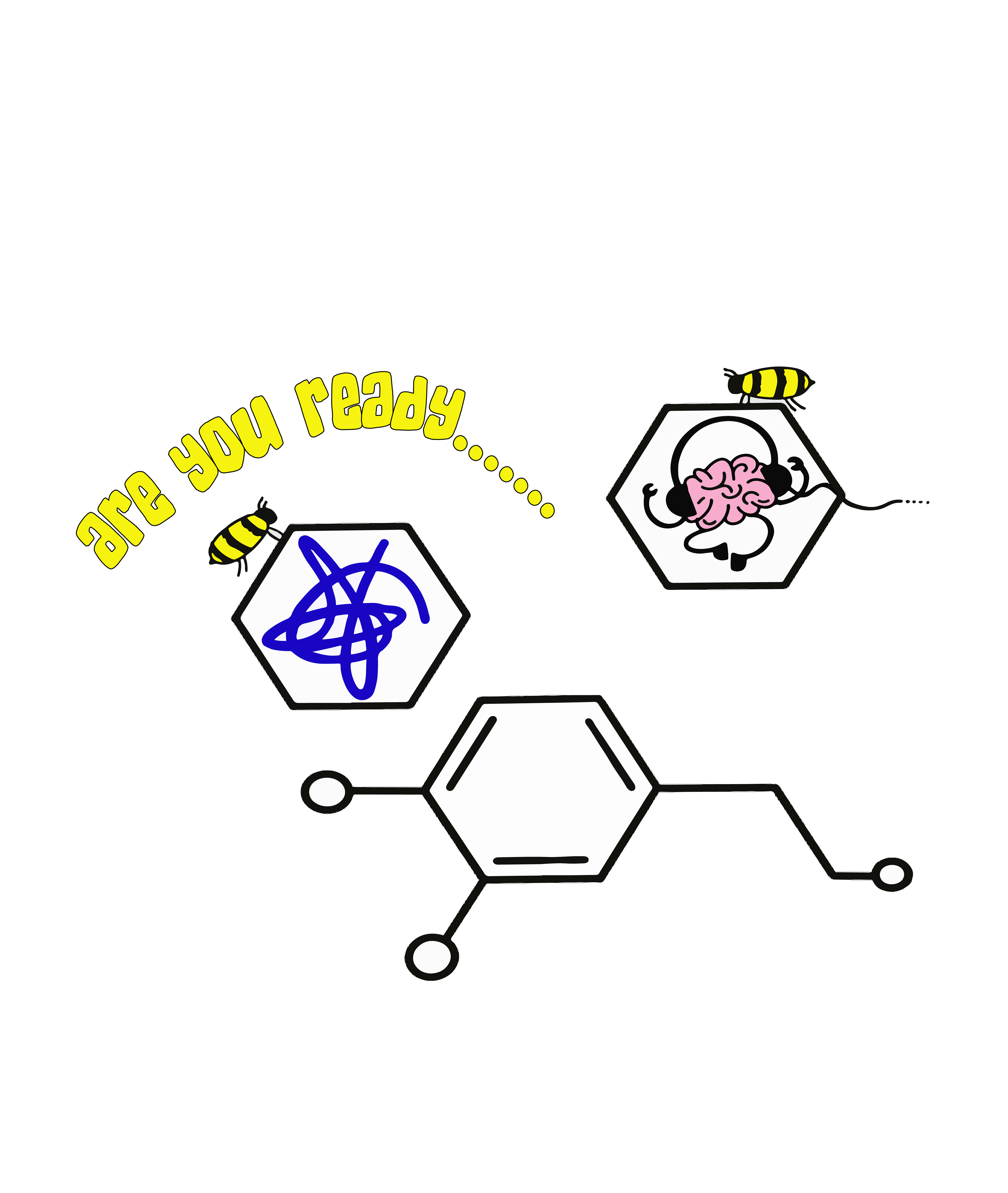
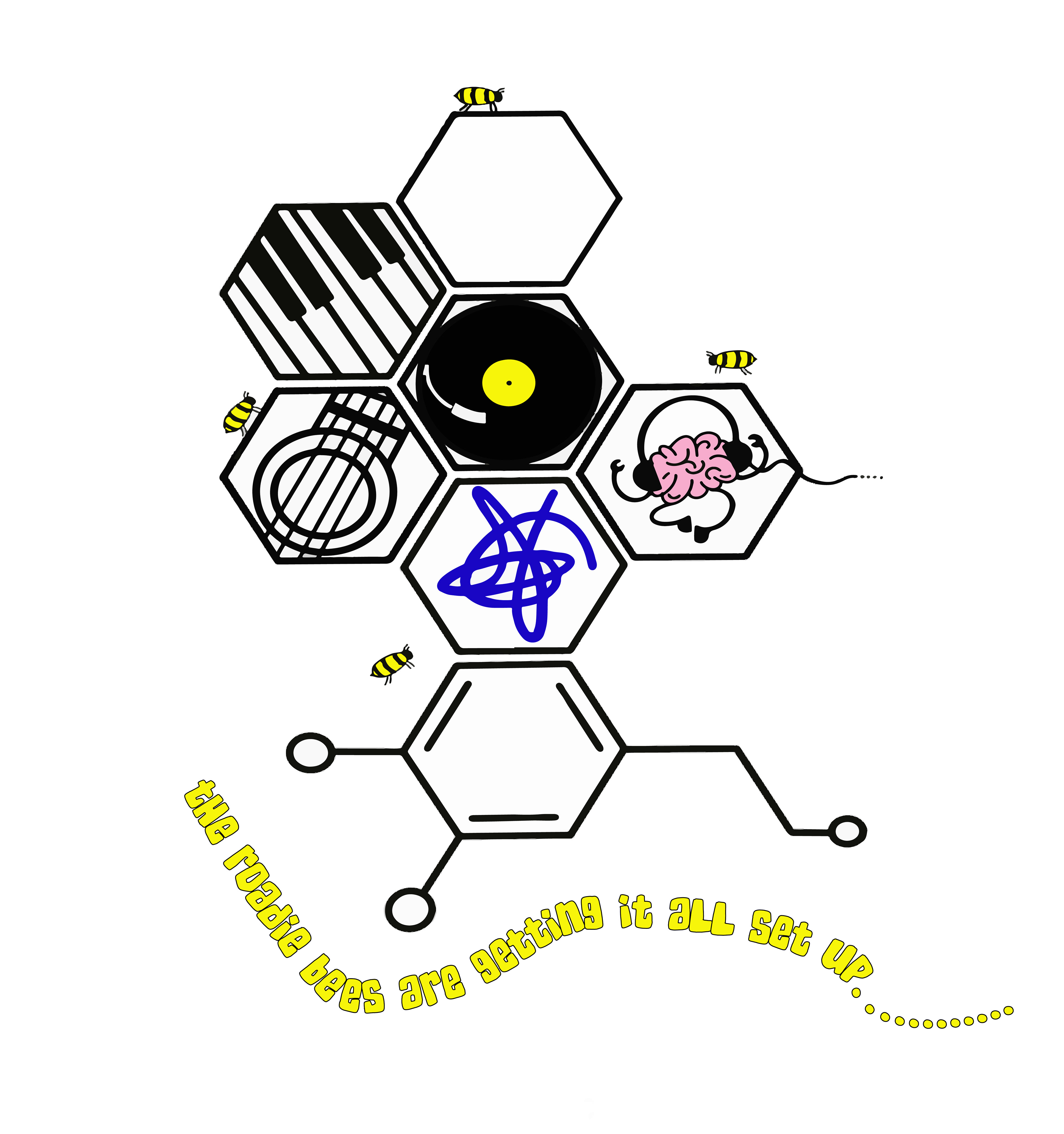
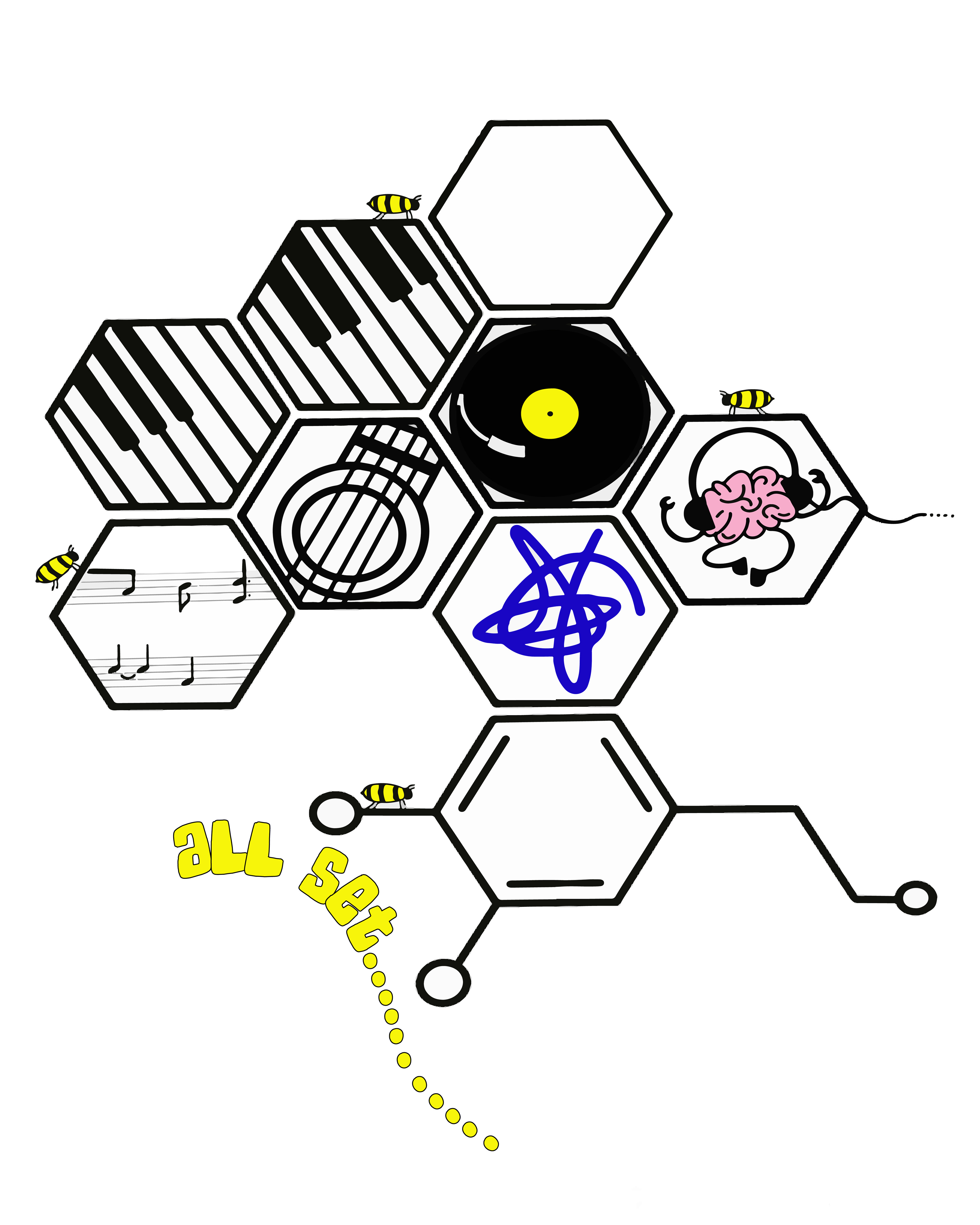
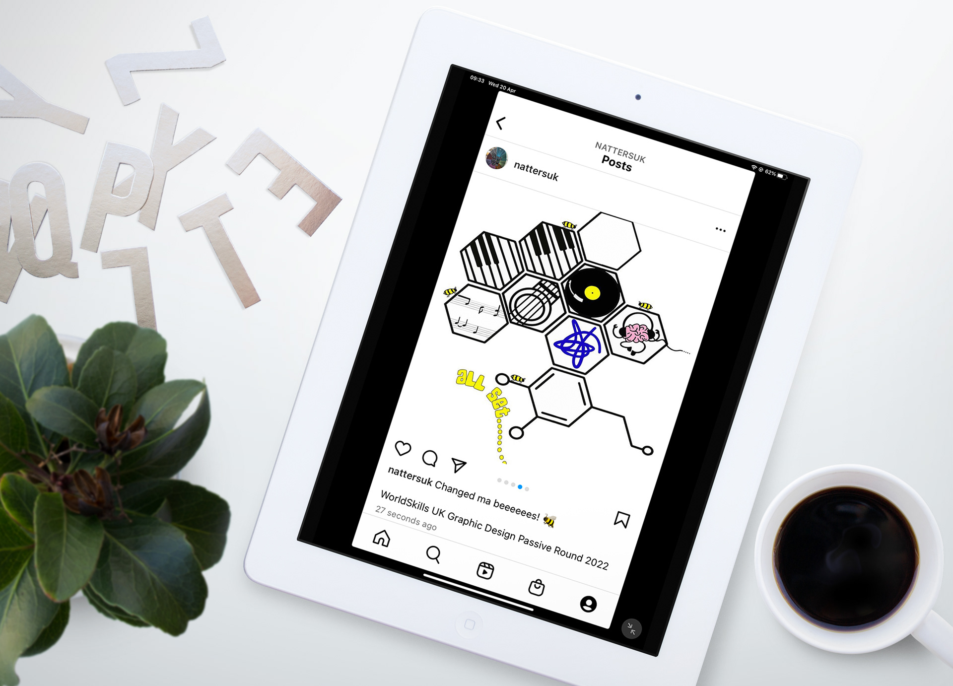
When reading the brief and researching the subject I found out what an impact music can have on our psychology and improving our mental health. I wanted to incorporate the chemical compounds Dopamine as that is what music produces in our brain when listening to music and Oxytocin as that is produced due to kindness. I discovered that the shape of the chemical compounds is the same shape as honeycomb – nothing says community, support, and collaboration than bees and I believe there’s nothing cuter.
Using the honeycomb as frames I added musical instrument icons and included two elements as a nod to Manchester Mind – including their squiggle logo and a wee brain I found on their Instagram page.
My colour palate is fun and funky with a positive, festival feel – the background colours can be changed to match the situation and a transparent version so it can be placed over information, similar to the YANA branding.
My font choice is SkaterDudes for the title of the festival – Be Kind – this is a bold, funky, fun font that draws immediate attention to the title. For the rest of the information, I used a clear san serif font for good readability, Bahnschrift.
For the 5 Instagram posts I wanted to use each post to build up the tension by using the bees as Roadies slowly building the stage (logo) with each post you can add another piece of information about the line up, venues or booking information – for the last post all information will be revealed.
I love the branding for the YANA festival so wanted to keep the fun cartoony feel to the branding for this festival too, although the cartoons are simple it is clear what they represent and that music and the mind are the main subjects.